Friday 25 February 2011

3rd test....

 Here is a rough idea for the textures shoot. Skin will be fresh and contoured before the gold leaf is added. Eyebrows will be natural, slightly shaded and brushed upwards. Illamasqua liquid metal has been added on top of the gold leaf. I have decided to go for a more bronze based look, with other metallics added.
Here you can see where I have put one set of eyelashes on the models left eye. I did this to test which I liked more... natural, without lashes or one set on one eye. I'm still in two mind to which I prefer so am going to have a little think about it and possibly take some more pictures. I did also try the gold liquid metal on the neck, but it was just not strong enough and clear enough to what I had hoped, so am going to purchase a thicker alternative.

A change in decision and test shoots....

I have done some test shots, these have not been created on models. This was done merely to get the make-up down on the face in order to be able to develop it further. After speaking to the marketing manager of Kodak, I unfortunately heard that it would not be possible to do a marketing campaign for the dimensional printing, as there are just not enough printers available at this time, what with them being so new. So as an alternative Mr Pat Holloway has offered for me to market their epson printers instead. This was a bit of a disappointment as my whole idea of the 3d image has gone but the fact Kodak are still willing to work with me is a plus. So he then asked for me to literally get the make-up on just a friends face and email them over to send for a test print so that I am able to see the quality of the prints before continuing. So this is what I have done.

The tests for 2 of the make-up's....
                                                                       sweetie shoot
                                                                        depth shoot.

3rd design...

 Texture is the focus of my 3rd design. First of all the base is going to be clean and fresh with slightly contoured cheekbones. Using gold leaf either in a gold or bronze on one side of the face as shown above along with Illamasqua liquid metals pressed around it. On top of the mixed metallics 3 paper flowers will be sprayed gold/bronze and stuck on top of the gold leaf.
 There will be slight brown shadow on the corners of the eye to give it a little more depth and the 2 sets of eyelashes will be used for the look. This will create a style like the image above. Eyelashes on top and below the eye. Lips will be kept pale.
 Using gold, bronze or silver paint (depending on the models hair colour and complexion) to smother the neck, merging towards the face.
The hair will be long (similar length to the image above) and of course texture. I love the way her crimped falls naturally.

Tuesday 15 February 2011

2nd design...

For my 2nd design I want to create depth and I thought that I could do this by doing a lot of contouring with darker shades
Really love this picture below, so want to use it as inspiration. Love the contoured cheekbones and jewelled eyes. This image shows depth and creativity.I  also really like the gold, however I think for my piece I would like to use navy, purple and silvers.

 The eyebrows below are really nice so, am also going to incorporate  this with in the eye make-up I already like.I think I will do this by sticking the eybrows down first and then work on top.
 

Just naturalite black lashes will be used to finish the eyes off. The skin needs to be a clean base with contoured cheeks. As for the lips I want to have them darker around the edges fading to a lighter shade:


My 1st design...

Firstly I had to think about the printing side of things before I designed my make-up's. There needed to be shown lots of colour and depth.
DESIGN 1: For my first design, I wanted to keep it fun and colourful, after all, that is what kodak's printing are all about. So the first make-up is done using the inspiration of sweets. There was a really nice image that I found and felt I wanted to re-create...with a few  differences.

The picture above is the one I was saying about. I felt that when looking at the image it could look better if the eyebrows were taken completely out...so this is my plan. The colours will be slightly different also. I want to keep it a little child like by possibly using/making my own paper lashes.
I want the base to be pale  with a sugary look to the cheek bones...

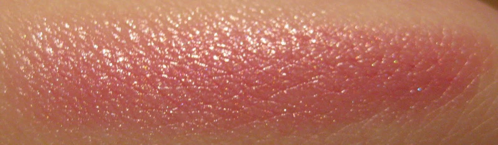
This is actually a MAC lip product, but I think it could look quite nice on the cheeks.
On the lips....I have a few ideas. I either want to use actual sweets or just make-up...


The hair is going to be double/triple crimped, backcombed and sprayed baby pink making it look almost like candifloss. Sweetie accessories will also be used.

Tuesday 8 February 2011

The make-up...........

For the 3 photo shoots, I am planning to do 3 separate hair and make-up designs that show a lot of detail and colour. The aim of doing this is to then be able to show the public, how good the quality of the image is and how clearly the colours and detail are shown. I also want it to be colourful and detailed so that it stands out from the rest of the advertisements. I want to be able to attract the public.


 Love the variet of colour used in this, but not only is the colour striking; also the texture of make-up used.
 Really like the depth of this make-up, a great focus on the eyes.
 Of course I picked this one for the texture. The scratched texture looks amazing and makes me almost want to touch the picture....definitely an asset for kodaks dimensional printing.
 Love the contouring make-up because it really does give the face lkots of depth.

 The use of eyelashes and colour in this one work really nicely....definitely something to think about for my the designs!


A passion for make-up used to create a reaction. I want to create a marketing campaign that I can show in the centre of town to the Southampton public.
Marketing campaigns are everywhere, but how can a new marketing campaign be made more current and fun. My initial idea was to make my marketing campaign new and current by making it 3D.
In order to do this, research had to be done to gain a better understanding of how it would be possible. Photoshop was the way forward for this idea and so I looked on youtube and found many tutorials of how to do it. I also found a website to get free 3D glasses which was great.
The next step was to email a couple of companies that print large 3D images for displays and here are some of the ones that I emailed. I decided that whoever I would use I would base my marketing campaign on them. I was hoping that they may possibly support me if I were to advertise for them for free. This means the costs would be kept very low and the company would get free advertisements.
Once looking further into my idea, there were some issues. Because the 3D image would be made using the red and blue filters the actual quality of the image would not be as good as the public would see in the cinemas, therefore the public’s reaction wouldn’t be as accurate. I needed to find a solution for this.

Kodak came to the rescue with a new way of printing that creates a look that is layered and almost 3D but is actually just a flat image. After discovering this new technique, I sent an email straight to Kodak. Within a couple of days I was lucky to receive a very helpful reply... Jenny Duncan, the lady who got my email had spoken to the marketing manager and he had very kindly given me his mobile number and asked if I could give him a call Friday to discuss my ideas.
'A revolutionary digital print technology that creates raised—or 3D—text and images to differentiate and add value to the creative piece.’
Here is a small diagram of how the dimensional printing works. A thin coating is applied to the top of the image giving a raised look to certain colours. This gives it that ‘3D’ look.
Kodak have already just started making the marketing campaigns more current. I’m hoping to show more fashion and colour to advertise the current, quality of the image!